The world is awash in data, and now your desk is too! Once you’ve collected your data, it’s time to turn it into information that brings understanding. To do this, you’ll need to calculate and present various statistics from your data. Refer to SARE’s technical bulletin, How to Conduct Research On Your Farm Or Ranch (www.sare.org/research), for an excellent introduction to statistical approaches for agricultural research.
Statistical analysis can be a complicated topic and it’s vital to your project that you do it correctly, so we recommend seeking help with this step. Consider whom you can reach out to for assistance analyzing your data, such as the math department at a local college, your Extension service, or even a high school teacher who’s seeking an applied project for an advanced class.
To prepare your data for analysis, you’ll start by ensuring that all of your datasets are assembled and all quality control (QC) activities are complete. Once you have all of your data together, compiling this information into a table will enable you to perform your analyses.
Basic Statistical Concepts
Summary statistics are used to describe what you observed. For example, we often hear things described in terms of averages. The most commonly used type of average is the mean, calculated as the sum of a list of numerical values divided by the number of values in the list. There are other ways we use statistics to describe a dataset, such as how widely the values vary and how the differences are distributed.
Your project may also require statistics to demonstrate comparisons, such as when an experiment compares a treatment group with a control group, to determine if the treatment brought about an effect. If the two groups are different, statistical tests can determine if the difference is statistically significant. In scientific studies, significance is a rigorous assessment that reveals how likely it is that the difference you observed could have happened by random chance. If we’re interested in the relationship between one variable and another, statistical tests are used to determine a correlation. It should be noted that even if two variables are correlated, this doesn’t necessarily prove that one is caused by the other.

Data Visualization
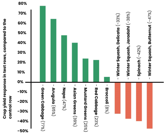
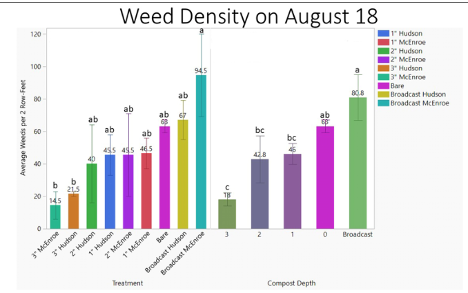
Whatever type of statistical analysis you use for your project, you’ll display your information in a visual way to help your audience understand your results. From a simple table to various kinds of charts and graphs, visualizing your data is an important part of connecting the data with your initial question and supporting your conclusion and interpretations. Maps, photos, and diagrams can also provide context and understanding.
Assignment
If you need help with any of the following questions, or if you’re unsure of your answers, Lesson 10 contains some suggestions of where to find help.
- Ensure that all of your data has passed QC checks. What were the most common errors you found?
- Enter all data into one or more tables for analysis (you don’t need to include your table on this sheet). The first column should contain the identifier for the observations (such as a plot or sample number), and each subsequent column should represent a variable. Each row should represent an individual observation. Be sure to clearly label the column headers and to specify the units you’re using.
Example:
| Ear tag number | Calving date, 2025 (MM/DD) | Calf weight (pounds) | Calf sex (M/F) | Calf VIGOR score (1-25) |
|---|---|---|---|---|
| 247-A | 2/25 | 68 | F | 23 |
| 329 | 2/25 | 77 | M | 19 |
| 515 | 2/27 | 69 | F | 21 |
Please list the title(s) of your table(s) here. Also list the column headers for each table.
- List some of the useful summary statistics you might use to describe your data.
- List any statistical tests you’ll perform to understand your results. Identify people or other resources you’ll use to ensure you perform these tests and interpret their results correctly.
- Given the nature of your data and analyses, what types of graphs do you feel would best express your findings? Are there any other visuals that you’d include?
- Does anything stand out from your analysis that surprises you?
Assignment Self-Evaluation
- Does your analysis tell a story? Is there a “take-home message?”
- Do the results of your analysis match with your impressions and experience throughout the project?
- Could someone who is completely unfamiliar with your projects understand what your results mean? If not, what can you do to make things clearer?